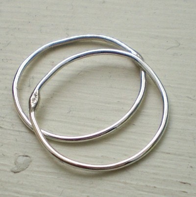
two of a kind.
>> Thursday, May 3, 2012
 |
| in with the new... |
 |
| and out with the old! |
i have been trying to retake some of my "old" product photos as i go since i feel that my workmanship and style has changed a little over time - plus i am loving the more "rustic" feel of the windowsill background. the skinny stacking ring set of two is definitely done more justice in the new photo (1st one) than the original, in my opinion! although there isn't much difference between the two products, the texture in the background of the 1st photo is definitely more interesting than in the 2nd, and also shows off the great texture of the rings.
the secret is to have stunning photos and great product descriptions and i try my hardest to have both - but it is definitely a learning curve.


0 comments:
Post a Comment